Branding configuration
The portal allows you to customize its appearance to match your organization's brand identity. This guide will help you configure the branding settings.
Accessing Branding Settings
- Select Administration in the sidebar.
- Open User interface → Branding.
Each setting has an edit button; the search box finds a setting by name.
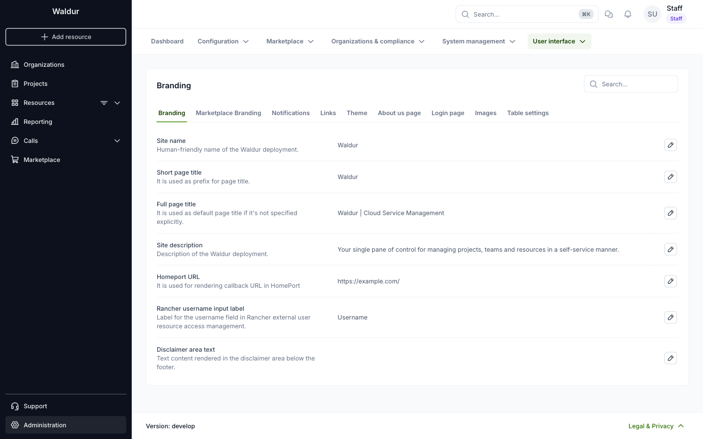
Available Customisation Options
Branding
- Site name: Human-friendly name of the Waldur deployment.
- Short page title: Prefix of the page title.
- Full page title: Default page title when a page does not set its own.
- Site description: Description of the Waldur deployment.
- Homeport URL: Used for rendering callback URLs in HomePort.
- Rancher username input label: Label of the username field in Rancher user access management.
- Disclaimer area text: Text shown in the disclaimer area below the footer.
On the same page, you will find more tabs to customise
- Marketplace Branding
- Notifications
- Links
- Theme
- About us page
- Login page
- Images
- Table settings
Note
All changes in branding settings will be applied system-wide. Please preview changes before saving to ensure they meet your organization's visual guidelines.
Recommended sizes and formats for all branding images
These images are used across the platform. Images larger than the suggested sizes are supported, but will be scaled automatically to fit.
Site logo
- Displayed in the Marketplace order header.
- Format: PNG or SVG
- Recommended size: ~160–180 px wide and ~20-32 px high
- Avoid vertical/tall logos for better visibility.
Sidebar logo
- Displayed at the top of the sidebar menu.
- Format: PNG or SVG
- Recommended size: ~160–180 px wide and ~20-32 px high
- Horizontal logos provide the best readability.
- Vertical logos are supported but will appear smaller.
Sidebar logo (mobile)
- Displayed in the mobile sidebar.
- Recommended size: Same as desktop (~32 px height)
- Horizontal layout preferred.
Sidebar logo (dark mode)
- Displayed in dark theme sidebar.
- Recommended size: ~32 px high
- Use a light / high-contrast version for dark backgrounds.
Powered by logo
- Displayed at the bottom of the login view.
- Recommended size: ~150–180 px wide
- Horizontal logos work best in this compact area.
Hero image
- Displayed in the HomePort landing page hero section.
- Minimum size: 1600×400 px
- Requirements: No text or logos in the image and keep the center area clean for headings.
Marketplace hero image
- Displayed in the Marketplace hero section.
- Minimum size: 1600×400 px
- Clean, wide image with no text
- Choose darker images for dark mode, brighter images for light mode.
Call management hero image
- Displayed in Call Management landing page hero section.
- Minimum size: 1600×400 px
- Wide image with no text
- Keep the central area free of visual noise.
Login logo
- Displayed on the login screen.
- Recommended size: ~180×40 px (horizontal PNG)
- Scales well across desktop and mobile.
Favicon
- Displayed in browser tab.
- Recommended size: 32×32 px or 64×64 px
- Format: PNG
Offering logo placeholder
- Default image used in offering cards.
- Recommended size: ~200×200 px (square image; cropped to circle).
Keycloak icon
- Displayed on the "Login with Keycloak" button.
- Recommended size: ~40×40 px
- Use a simple icon with a clear silhouette.
- Format: SVG, PNG